Research & resources
Brand Guidelines for members
Index to the Brand Guidelines for members:
1. Logos
The logo is the visual symbol of what the organization and its members stand for. That is why is it critical that the logo be both visually striking and consistent.

This is the primary logo and should be used the most.

The secondary logo is in a stacked format. This should be used in places where the primary logo doesn’t work due to its size or when the strapline is too small to be read. Some places where you may use this is on social media, branding images or email signatures.

This seal is approved for use under licence by schools and other accredited training providers. They are not permitted to use either of the two logos above. This is to distinguish independent businesses operating under IFPA guidelines from the core organization itself.
2. Who can use the logo
In order to protect our brand integrity, logo usage is restricted as follows:
• The IFPA logo may only be used to promote the activities of a Full IFPA member on their promotional literature / websites / social media etc.
• The IFPA logo is not to be used on training certificates.
• Should a member cancel their membership, they must discontinue using the IFPA logo with immediate effect.
• Associate / Student / Non-practicing members are not permitted to use the IFPA logo.
Please note that the IFPA does not endorse products of any kind and it is strictly forbidden to use the IFPA logos for this purpose. Should we become aware of any such occurrences, the IFPA reserves the right to cancel membership and seek the withdrawal from market of any product affected.
Examples of such misuse include but are not limited to
• Product labelling
• Packaging labelling
• Product marketing of any kind
3. Logo usage
Please follow the below guidelines when using the logo
• Never allow text or any other elements to ‘invade’ the logo.
• Never redraw or alter the logo.
• Don’t change the font.
• Don’t squash, tilt or change the dimensions of the logo.
• Don’t change any of the colours.
• Don’t place the logo on a cluttered background.
• Don’t insert the logo within a sentence.
4. Logo Positioning
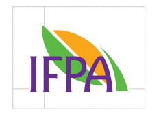
It is important that the logo has enough ‘free space’ around it so that it stands out amongst everything else on the page.
As a rough guide, use the top line of the ‘F’ as a measuring guide and ensure this is the minimum amount of free space surrounding the logo.

Sometimes our logo will appear in close proximity to another logo. In these cases, in order to maintain a point of differentiation and avoid any logo looking squashed, it is possible to separate the two with a vertical line, the same height as the IFPA logo


